|
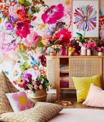
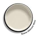
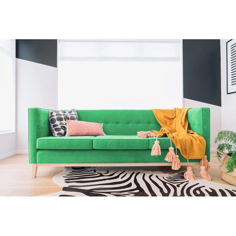
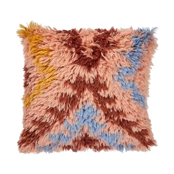
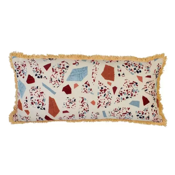
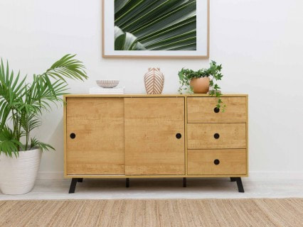
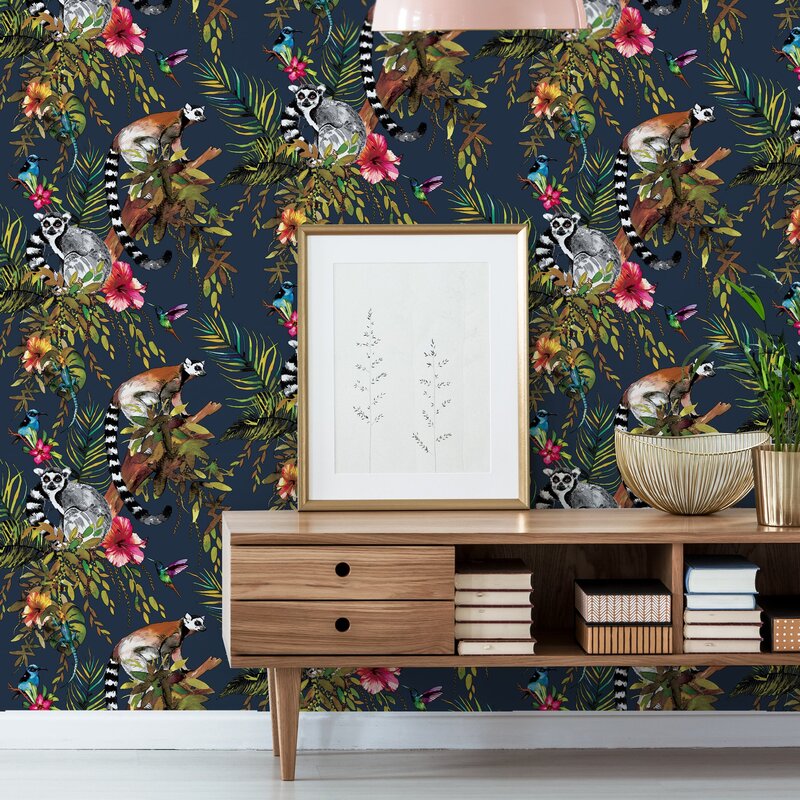
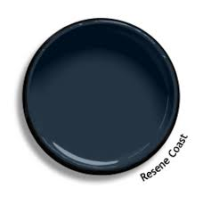
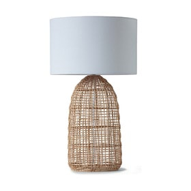
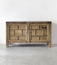
BEIGE... it generally conjures up images of a pale, fawny, sandy colour that you'd usually associate with dreary, dull and old fashioned interiors, right? Well guess what? IT'S BACK, it's on trend; and with a bit of style know how, it definitely doesn't have to be boring! I've found the VERY BEST beige paint hue out there, and when paired with wallpaper it looks BLOOMIN' beautiful! We're also going to cross over to the dark side in our 2nd colour trend tutorial this week. Why? because I know a lot of people still remain anxious about using dark colours in interior spaces. With a bit of style know how, I'll show you how dark tones can be used to create drama and warmth without compromising on the sense of space in a room. STYLIST TIP: Achieving a 2020 colour trend (navy, hunter green, beige) is easy - simply look to nature as your design compass, and bring the outside in. BEIGE-ING GRACEFULLY... If you consider beige to be uninteresting, mundane and tame, think again. Beige is one of the best neutrals out there, as it can work in a variety of spaces regardless of room size, natural light, era, or style. Trust me, there's a beige paint out there for you, no matter what your decorating approach. My absolute fave is Resene 'Albescent White' as it's incredibly versatile and pairs well with a wide array of colours and accents. Additionally, beige brings both warmth and a sense of calm to a space - something that the current trend of 'grey' simply cannot match. Used tonally, beige walls, mixed with a little stone, natural wood and linen textiles will instantly make a room feel restful and serene. Alternatively mix beige with a bold wallpaper and pops of colour for a vibrant and contemporary look. OUTSIDE IN... If you read my blogs; and follow me on social media, you'll already know that I like to push the boundaries when it comes to colour. My first tutorial this week, pairs bold with beige to create a bright and playful living space. Bringing the outside in, I'm taking my colour cues from nature (I'm not talking leafy greens or stony hues here, instead think sunset orange, azure blue waters, tulips and fresh lime). For this, I have chosen an Aspiring Walls mural 'Bloom Boom' to be the key feature element in the room. To ensure the magnificent colours pop, I've paired this mural with 'Resene Albescent White' paint. I highly recommend painting the walls, ceiling, window trims, cornices and architraves all in the same beautiful beige hue. STYLIST'S TIP: Use a semi gloss finish on the trims and arcs for a subtle contrast. The uniform use of paint will make the room feel bigger and won't distract the eye from the feature mural. Featured above: Aspring Walls Murall - BLOOM BOOM, Resene Albescent White and Miss Lolo Clemintine Couch in Emerald SPEND, SPLURGE AND SAVE SYTLING.... When it comes to styling a space such as this, be as bold as you like . Resene 'Albescent White' can be paired with a limitless selection of colours, so don't be afraid of really comitting to that bright and playful aesthetic. I suggest you Spend on a striking Miss Lolo Clementine Couch (see above - NB. Emerald is my pick, but any of their fabric colours will work here) and style it in front of that AMAZING 'Bloom Boom' accent wall. Splurge on a selection of Sage and Clare cushions from STFD, and Save with the Kirra Buffet from Mocka. WHO’S AFRAID OF THE DARK? It seems a lot of people fear the dark (paint that is) and I want to change that. Yes, using a dark colour in your interior spaces is a daring and dramatic design decision, but one that can definitely pay off if you're bold enough to embrace the dark side. For my 2nd colour tutorial, I've chosen nature's midnight sky as my inspiration (Navy being one of the 2020 colours of the year). Ive chosen to pair this with Aspiring Walls 'Imaginairum Lemur' Wallpaper for my room's feature detail. To create an intimate and cosy vibe I've chosen to paint the remaining walls, trims, cornices and arcs in my favourite navy hue - Resene 'Coast' (as above use a semi gloss finish on the trims for a subtle contrast). Use natural elements such as timber, rattan and seagrass to keep the 'outside in' styling cohesive; as well as providing lighter tones to contrast and lift the space. SIZE DOESN'T MATTER! It's a pretty common misconception that using dark colours on walls will make a room feel small. Size doesn't matter - any size room can go dark. Dark bathrooms ooze luxury, dark bedrooms feel cosy, dark hallways scream elegance and the list goes on. Whatever size, shape or function, it can work. Not only do dark walls look amazing but they also allow art, photographs, plants, and furniture to really pop against its dramatic backdrop. STYLIST'S TIP: Patterns LOVE to be with other patterns!! When styling a room with a patterned wallpaper don't be afraid to infuse the space with contrasting styles - mix and match florals with stripes, geometrics with spots and ikat with animal. SPEND, SAVE AND SPLURGE STYLING... Just like a plain white wall, a dark wall equally needs something to break it up. Mirrors, photo wall arrangements, furniture and art all help to break up the space, as well as cut into the expanse of dark. I suggest keeping the styling simple - save with the Rattan Table Lamp from Kmart and splurge on a Rennes natural Sisal Rug from Source Mondial and an Elmwood Rice Sideboard from Indie Home Collective. Whatever your 2020 colour trend preference, paint is by far the simplest and most cost effective way of transforming a space. If you want to introduce texture, personality and colour to a room add a wallpaper, but choose carefully as this will be a more long term investment. If youre wanting to transform a space in your home, I hope this tuturial has helped to see beige in a new light and you're no longer fearing the dark. Go forth and bring the outside in at your place and be sure to send me some images so I can post them on my social pages.
Happy Styling! Annick x
0 Comments
Leave a Reply. |
AuthorAnnick Larkin - Stylist | Content Producer | Creative Director Archives
April 2020
Categories |

 RSS Feed
