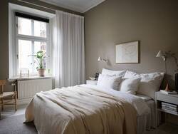
 THE COMEBACK QUEEN Every year a large group of respected designers, architects and global paint companies gather to identify the hottest interior design colour trends for the upcoming year, and you may be surprised by their crystal ball predictions. For the last few years, various shades of grey have been slathered on walls all over NZ and across the globe. However, according to the aforementioned group, beige is ready for her comeback. SAY WHAAAAT? Other trends to expect in 2020 include deep, bold tones such as navy and hunter green (phew), more natural wood in furniture, décor and cabinetry (I like!), and a movement toward more neutral colours such as French Vanilla(meh), Mint (yum!), Sage (double yum!!), Hazelnut and Warm Grey (meh). HOW TO… BEAT THE BEIGE IN YOUR BEDROOM So according to those making these predictions, these colours aren’t just about how they look in a space, but more about how they make you feel. So, rolling with that analogy, I’m going to show you how you can embrace the neutral trend using a few of my favourite Resene paints, and style them with a colour loving twist. I personally love green walls in a bedroom. There’s a reason hospitals use it, as it's a restful and calming hue, however you'll find my choices are not as insipid as the dingy old hospital waiting room; instead, these colours will make you feel cosy and relaxed, turning your bedroom into that grown up retreat I think we’re all craving. THE WALLS: For those of you wanting something a little more subtle I suggest two coats of Resene Juniper (tone: muddied mint) and for those that prefer the dark side opt for 2 coats of Resene Balderdash (tone: seductive sage). Either way, they’re two of my all-time faves and will look incredible in your space.
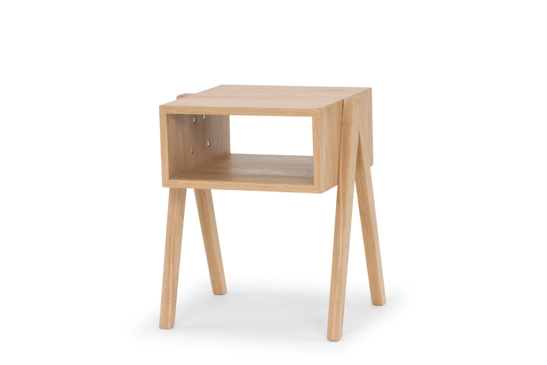
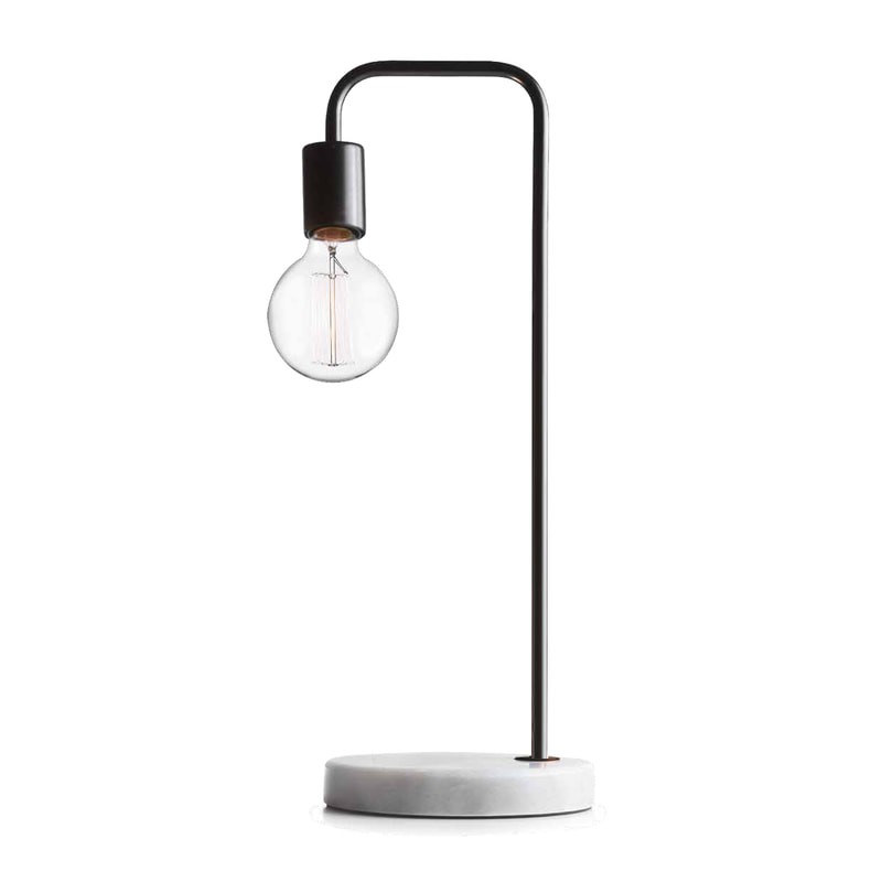
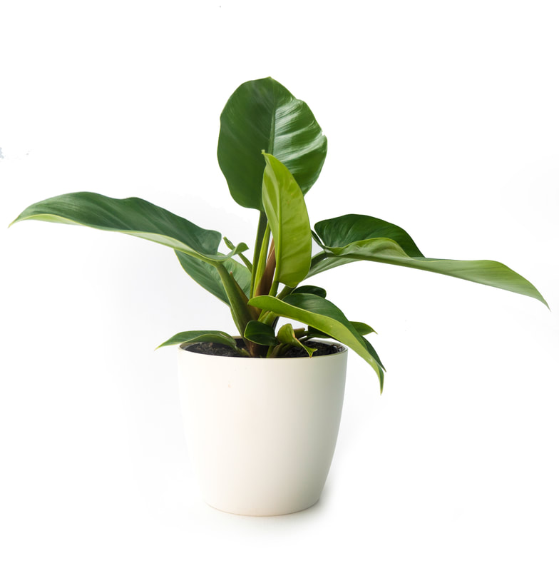
STYLING YOUR SPACE: COLOUR SCIENCE 101.. Given green is created through a mix of blue and yellow, use these tones as your accent colours (they can fall anywhere on the colour spectrum from deep navy to the palest of blues, from the brightest yellow to a dirty mustard) as they will always work well when paired with the mint or sage tones of Resene Juniper or Balderdash. Alternatively, for a more feminine vibe, opt for pink or lilac accents as they simultaneously contrast and compliment green on the colour spectrum. For those die hard colour enthusiasts out there, I suggest using orange for a bold pop of colour 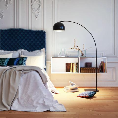 .I personally love a good navy blue as a contrast to green (and hey, it’s also very on trend), so for a fabulous focal point I suggest investing in a beautiful headboard. I have one from Miss Lolo in my bedroom & LOVE IT! Click the link to view her Cleveland Design Headboard in Essence. My pick for this gorgeous quilted velvet fabric is 'Atlantic'. https://miss-lolo.myshopify.com/collections/headboards/products/cleveland-design-headboard-in-essence. Pair with simple natural or white linen bedding for a clean and crisp look. Complete the look with timber bedsides such as these from MAMT (https://meandmytrend.com/tables/side/1-cubed-bedside.html), Marmo Marble Table lights form Kmart (https://www.kmart.co.nz/product/marmo-marble-table-lamp/1024804) and some potted greenery from www.giveplants.co.nz for that final style flourish. And voila! You've just nailed the neutral.
x
0 Comments
Leave a Reply. |
AuthorAnnick Larkin - Stylist | Content Producer | Creative Director Archives
April 2020
Categories |


 RSS Feed
